Problem
Tapbook made an early bet on AI booking. Alongside booking over SMS and voice, the product leaned on an Ask Tapbook prompt, AI-suggested times, and AI-drafted updates, all designed back in 2020. The first build was rushed and outsourced, and adoption stalled. I partnered with the founder to rebuild it end to end over four months, trading our assumptions about how people book for four rounds of watching them do it.
Process
We ran four rounds of moderated usability testing, two with clients and two with providers, and iterated between every round. The biggest shifts:
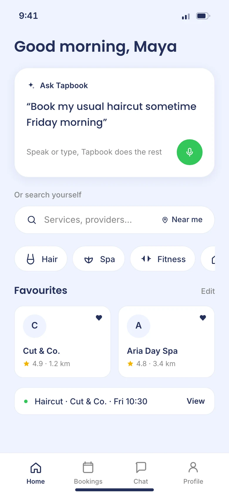
Client home. Search moved from the centre of the screen to the top, and we added a "Near Me" option after travellers in new cities surfaced the need mid-test. Category images became icons, and "Popular" became a personalized "Favourites" list with one-tap removal.
Provider home. We swapped a mid-page calendar for a task manager after watching providers hunt for the day's appointments. In every session, task-first beat calendar-first. Cards surface upcoming and completed counts so providers can read their day at a glance.
Search results. A dedicated back button replaced reliance on the home icon, a calendar icon absorbed the "when/where" fields, and filters became pills so they read as tappable.
Design
Outcome
The rebuild handed off as an interactive prototype and full documentation, ready for the developer to build against: twelve screens across both sides of the marketplace, each one traceable to a specific thing testing surfaced.
Appendix
To avoid designing from my own assumptions about booking, I ran two tracks in parallel: interviews with five users spanning service providers and clients, and a competitive analysis of Acuity, Booksy, Calendly, and Setmore. Four needs kept coming up: quick to learn, fewer steps per booking, one complete solution instead of several partial ones, and something that holds up on weak infrastructure.
"…most people in 62% of counties in the US did not have government minimum download speeds for broadband internet." (Setmore whitepaper)
The research condensed into two personas: a client who wants booking simple enough for her parents, and a provider drowning in manual scheduling. Their flows carry both through onboarding and booking, where the AI prompt sits alongside manual search instead of replacing it.
I built the brand alongside the product, because Tapbook needed an identity as approachable as the booking it promised:
Primary
#FFFFFF
Secondary
#242F5A
Accent 1
#C7D8FF
Accent 2
#34C759
Neutral 1
#F1F1F1
Neutral 2
#D3D3D3
Neutral 3
#858585
Inter
Regular · Medium · SemiBold · Bold
Body & UI
Poppins
Medium · SemiBold
Headings
The full story
Every artifact, decision, and iteration lives in the deck.
View the full deck · 32 slides · Figma