Problem
Rebrandt's platform had more usability problems than 40 hours of scope could fix, so the real work was prioritization, not design. Leading three designers with the CEO as our direct stakeholder, I audited 11 severity-ranked issues and negotiated them down to four deliverables with the founder. Rebrandt shipped the result to production.
Scope
Each designer audited the platform independently. We merged our findings and ranked every issue on Nielsen's severity scale, from cosmetic to catastrophe, so the prioritization conversation with the client would rest on evidence instead of opinions. We walked the CEO through all 11 issues and prioritized them together. That conversation produced four agreed deliverables:
- Restructure the information architecture
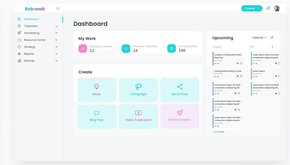
- Redesign the main dashboard
- Update the icon library
- Refine the secondary dashboards' UI and preview layout
Process
The platform's core job is creating and publishing a social post. I mapped the existing flows and found the same task reachable through two or three different navigation paths, each in a different menu. The redesigned flows consolidated them into one.
For the sitemap, my proposal and my teammate's shared some moves but disagreed on fundamentals. Rather than force a premature merge, I submitted both versions to the client with the reasoning behind each, and the CEO returned a finalized version that combined elements of both. The documented stakeholder changes became the contract for the design phase.
Design
Each designer produced a dashboard variation on a UI style our UI designer standardized: three different layouts, one decision for the client. We also rebuilt the icon library on Feather Icons, and I aligned the secondary dashboards with the new main-dashboard language.
Outcome
The client picked a final dashboard during our progress call and shipped the changes to their production site. Their feedback singled out brand consistency and ease of use. Beyond scope, we left them a moderated-testing script so their team could validate the designs with real users once they had them.
Appendix
How the work fit a 40-hour budget: six time-boxed phases, hours budgeted per task, and a rationale behind each choice. The platform had no user base to test with, so direct client-feedback sessions replaced testing and pulled the CEO into design decisions early (the full phase plan lives in the deck).
Competitive teardowns of Uberflip and Paperflite grounded the recommendations: brand consistency and a simpler IA from one, a cleaner UI bar and harder-working dashboard real estate from the other.
The full story
Every artifact, decision, and iteration lives in the deck.
View the full deck · 24 slides · Figma