Problem
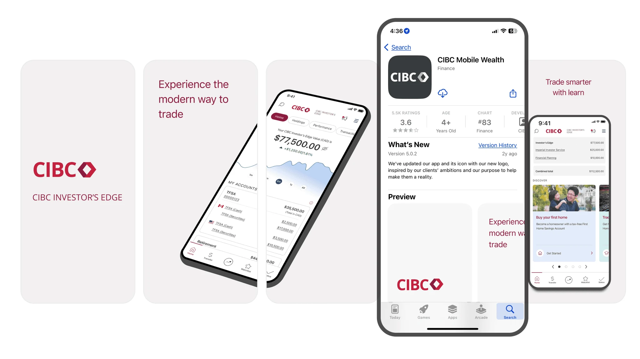
The App Store listing is acquisition real estate a bank fully controls, and half of app-store users decide on first impression alone. CIBC Mobile Wealth was losing that first impression: single-frame screenshots, no context on them, and nothing to show the app in motion. I treated it as a research problem before a design one, benchmarked the market to find the patterns the top listings shared, and designed the new set against the evidence. It is now live on the iOS App Store and Google Play.
Research
I benchmarked 27 apps: Canadian and US banks (BMO, TD, RBC, Scotia, Fidelity, Schwab) and fintechs (Wealthsimple, Questrade, Robinhood, Webull, Cash App, Revolut, Coinbase, and more), each scored against the patterns that separate the top listings from the rest. Ours was on the wrong side of the three that mattered:
- Video. Six of the 27 used video in their galleries, including 3 of our top 4 direct competitors. We had none.
- Panoramic screenshots. 11 of 27 used multi-screen imagery; among the 7 highest-grossing apps, 5 ran panoramic sets. Ours were static, single-frame screens.
- Annotations. All 27 competitors annotated their screenshots. Ours carried no context at all.
Process
The research collapsed into six principles the whole set would be designed against:
- Lead with autoplay video that shows the app actually running.
- Put the core value proposition inside the first two screenshots.
- Use panoramic imagery that stands out in search and invites a swipe.
- Order the screens most-colorful first.
- Keep annotations concise and large-type, anchored at the top of each frame.
- Frame the devices ambiguously so one asset set serves both stores.
Turning the benchmark into a numbered set gave the team a shared spec: every screenshot decision traced back to a research finding instead of a matter of taste.
Design
With the principles set, the design work was mostly restraint. I built one asset set, framed device-ambiguous so a single export served both the App Store and Google Play instead of two sets to maintain. I paired with the content writer on the annotations so they read at a glance and still named what the app does. The most colorful, most legible screens went first, because 60% of users never scroll past the opening frames, and that is exactly where the value proposition had to land.
Outcome
The set shipped to both stores in four weeks. Store-level impact tracking sat with the app team; the design's job was to close the three measured gaps, and it closed all three.
Appendix
The behavioral research under the redesign:
3–6s
before a new user decides: install, explore, or dropSource: Phiture
50%
decide on first impression aloneSource: Storemaven
60%
never venture past the first screen foldSource: Storemaven
+25%
install lift from store-listing videoSource: Storemaven
One finding set the priority order: barely 2% of users watch a listing video, yet video lifts installs by roughly a quarter. That is why video leads the redesigned set.
The benchmark board itself, abstracted: every listing scored against the same patterns. The full board is an internal deliverable and stays in the deck.
The full story
Every artifact, decision, and iteration lives in the deck.
Opens in Figma, shared under the same NDA terms as this page
View the full deck · 18 slides · Figma