Built to prove one sentence
The whole project is one hypothesis: the same components, given different tokens, should carry different products without a line of component code changing. Each chapter tests it by rebuilding screens from a product I designed, using the shared components and that product's own tokens.
Tokens first, then components, then real screens
I built it in that order, so the components draw their colour, type, spacing and corners from tokens instead of carrying their own. Real screens are the constraint: a chapter rebuilds screens from an actual product, not a demo page built to show the components off.
One home for every value
Every base value lives in one TypeScript file (opens in a new tab). A small build turns it into CSS variables for light and dark, plus the utility names the components use. Each chapter's overrides sit in the same folder, and a public-safety check fails CI if a colour code turns up anywhere else. The Tokens page (opens in a new tab) reads that file directly, so it shows every token and follows the light and dark toggle.
On top of the tokens sit 14 components: Button, Input, Textarea, Select, Checkbox, Radio, Switch, FormField, Card, Badge, Avatar, Tabs, Modal and Toast. Each has a Default story and state stories, 59 in all, with a control for every prop. Four docs pages sit beside them: Design principles, Tokens, Accessibility and Usage.
One call changed the plan. I had specced Storybook 9 and built on 10, because 9 depended on a package with a published security advisory.
Chapter 1 swaps the tokens, not the components
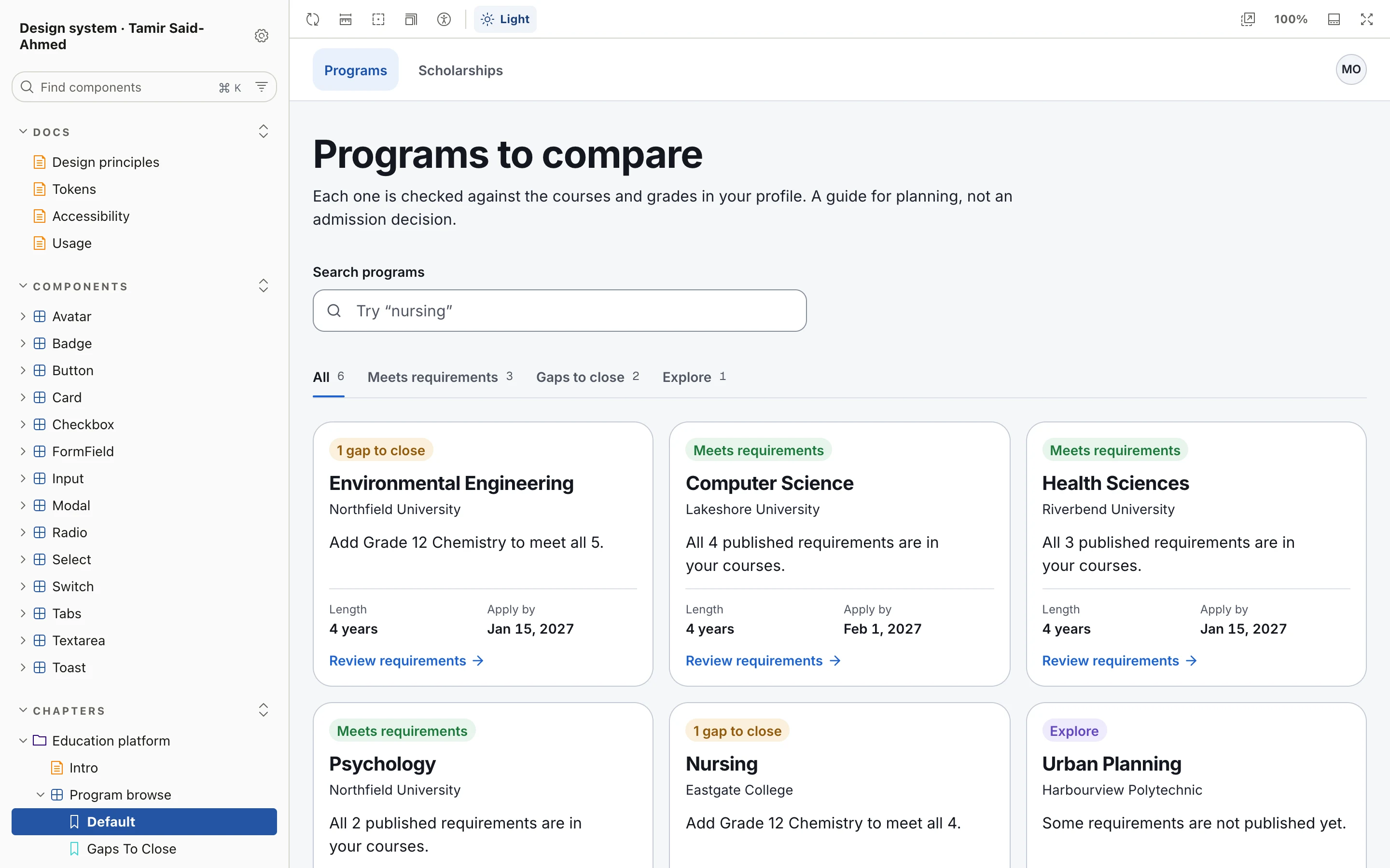
Chapter 1 is the first proof. It rebuilds three screens from an education platform that helps students figure out what to study: program browse, an eligibility result and a scholarship list, plus a before and after (opens in a new tab). That's 10 chapter stories. They use the same components as everything else, and the chapter theme (opens in a new tab) changes only tokens: the typeface, the corners, the control heights and the colours.
Every push runs the checks
The checks run in CI (opens in a new tab) on every push:
- Typecheck and lint
- Token freshness: the generated CSS matches the tokens file
- Contrast on every colour pairing the components use, in light and dark
- The public-safety check
- The Storybook build
- axe on every story, in both themes
Tabs (opens in a new tab) and Modal (opens in a new tab) also carry interaction tests that press keys and check where focus lands, and Toast's test checks the announcement screen readers hear. Every push to main publishes the Storybook to GitHub Pages.
Chapters 2 and 3 are next
Chapter 2 is Tapbook, from a previous role, and chapter 3 is a client project. Neither is built yet. Each gets the same test as chapter 1: its own tokens, the same components.
The Storybook and the code are both public, so you can check this page against them.